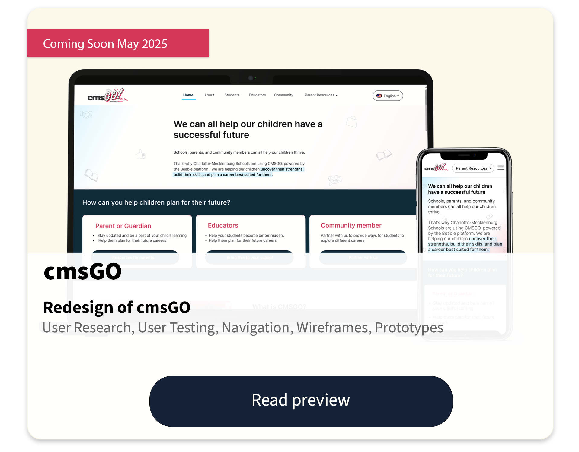
BNIA➟ BGC
This video shows BGC's main task of gathering a new set of data
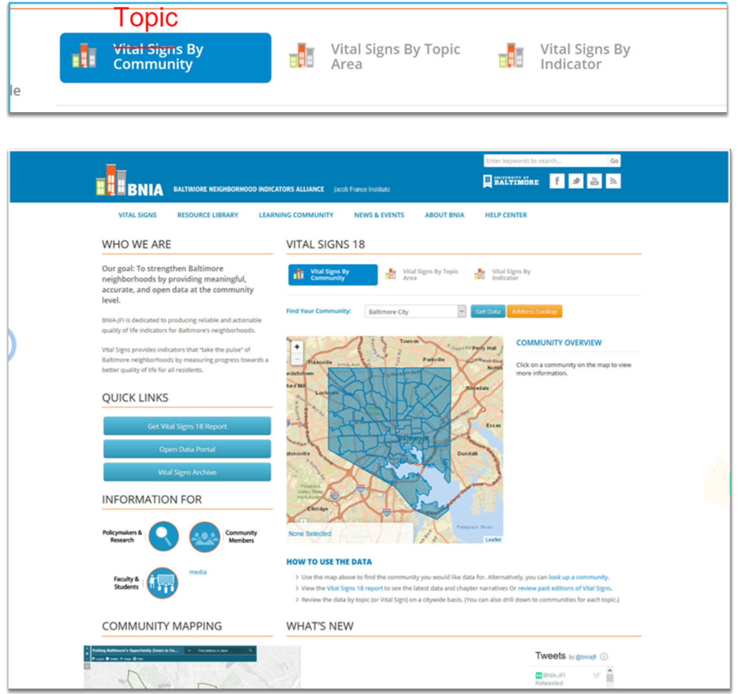
What is BNIA?
Baltimore Neighborhood Indicators Alliance (BNIA) is a non-profit whose main goal is "To strengthen Baltimore neighborhoods by providing meaningful, accurate, and open data at the community level."
Design problem
BNIA has a lot of valuable data that is difficult to access and use.
Our group's question is how can we help those who would benefit from this data enjoy and utilize the tool?
Some site problems
Here is a list of some site problems that made the site hard to use:
• Jargon
• Information Overload
• Not consistent
• Lack of Feedback
• Lack of filters and data comparing tools
• Information Overload
• Not consistent
• Lack of Feedback
• Lack of filters and data comparing tools
Our Groups Solution
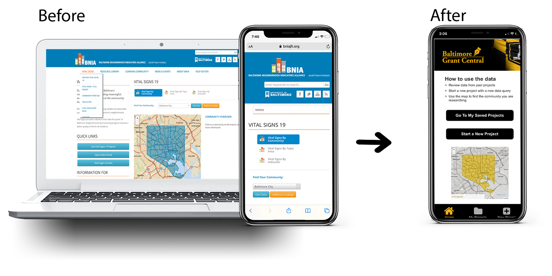
1. We Rebranded and redesigned BNIA to target Grant Writers.
• User research proves that this user segment would benefit significantly from BNIA's data.
• We rebranded the site to give off a professional, grant-focused, and Baltimore-centric feel. We also changed the site's name from BNIA to Baltimore Grant Central (BGC).
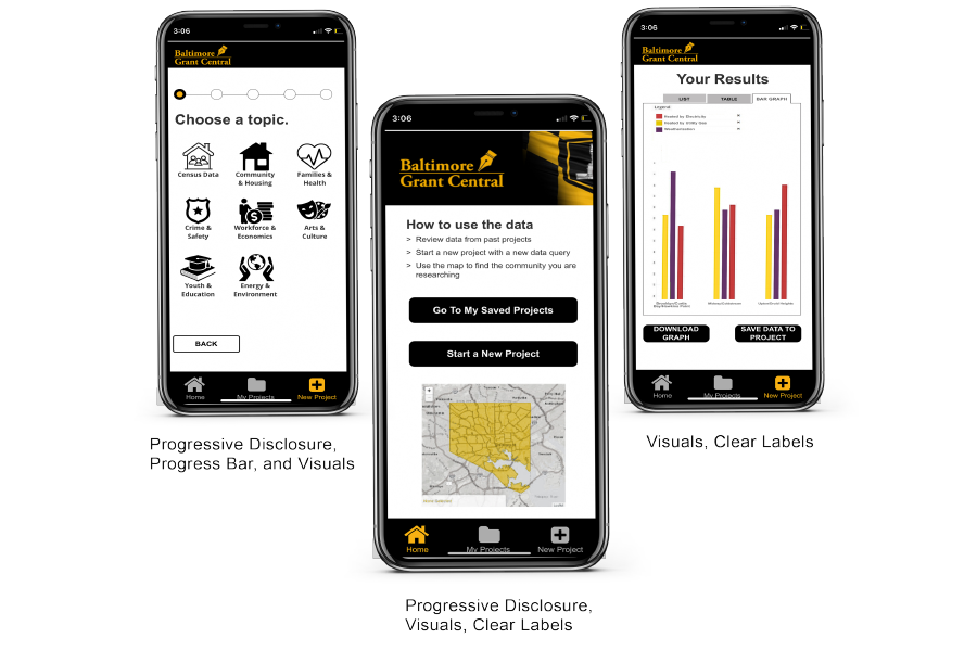
2. We Simplified the design, included a lot of visuals, and incorporated progressive disclosure to support our users' needs.
3. We Made the application a Progressive Web App (PWA)
The images below highlight the main design considerations that we had:
My role in the project
This project was completed as part of an Interaction Design course at the University of Baltimore's master's program.
It was a group assignment. The group consisted of myself and one other member.
Together, we came up with a design solution, completed user research, created wireframes and prototypes, and conducted user testing.
We then presented our findings to our class, and the presentation was passed on to our client at BNIA.
Summary of my UX roles:
• User Research
• Competitive Analysis
• Rebranding
• Wireframes
• Paper Prototypes
• Interactive Prototypes
• User Testing
• Presenting Deliverables
• Competitive Analysis
• Rebranding
• Wireframes
• Paper Prototypes
• Interactive Prototypes
• User Testing
• Presenting Deliverables
................................................
Let's step into the design process
Our solution came about through extensive research and user testing. Read below for a detailed description of how we created BGC
Research phase
Heuristic Evaluation
We began our research by conducting a heuristic evaluation using the Nielson-Molich system on the current BNIA site.
We found that the site was hard to learn, cluttered, and lacked consistency.
Proposed Solution
After conducting the analysis, our group brainstormed to determine what user group would benefit from this data and how to design a tool that would help them use it.
After researching different user groups who would benefit from census-like data, we decided to build a tool for grant writers.
Grant writers, write proposals that require statistical and accurate census-like data. As a result, the data located on the BNIA website would aid them in writing a strong proposal.
If the information was presented in a way that matched the grant writer's needs and expectations, we believed we could build a tool that would benefit this user segment.
Literature Review
Before getting into the designs, our group conducted a literature review. This review gave us an in-depth understanding of our user group as well as best practices for displaying data.
Defining our users
1. Occupational Needs
The review uncovered that there are three different subgroups in the grant writing industry that would benefit from this tool.
1) Freelance/ independent contractors
2) Full-time/part-time employees
3) Individuals seeking self-funding/ Do-It-Yourself
Summary of Findings
1/2) Freelancers and employed grant writers have a lot in common.
These users are writing grants as part of their jobs, are typically well-educated, good writers, detail-oriented, and collaborative.
However, they may differ in their work hours and environment.
However, they may differ in their work hours and environment.
3) The third subcategory- individuals seeking funding, can include a wide range of users, including professors, students, and other individuals who are trying to obtain a grant for a personal reason.
Since this subgroup includes a wide range of individuals, this application will need to support both novice and experienced grant writers.
Applying Findings
These three subgroups may have minor differences but they overlap in many areas.
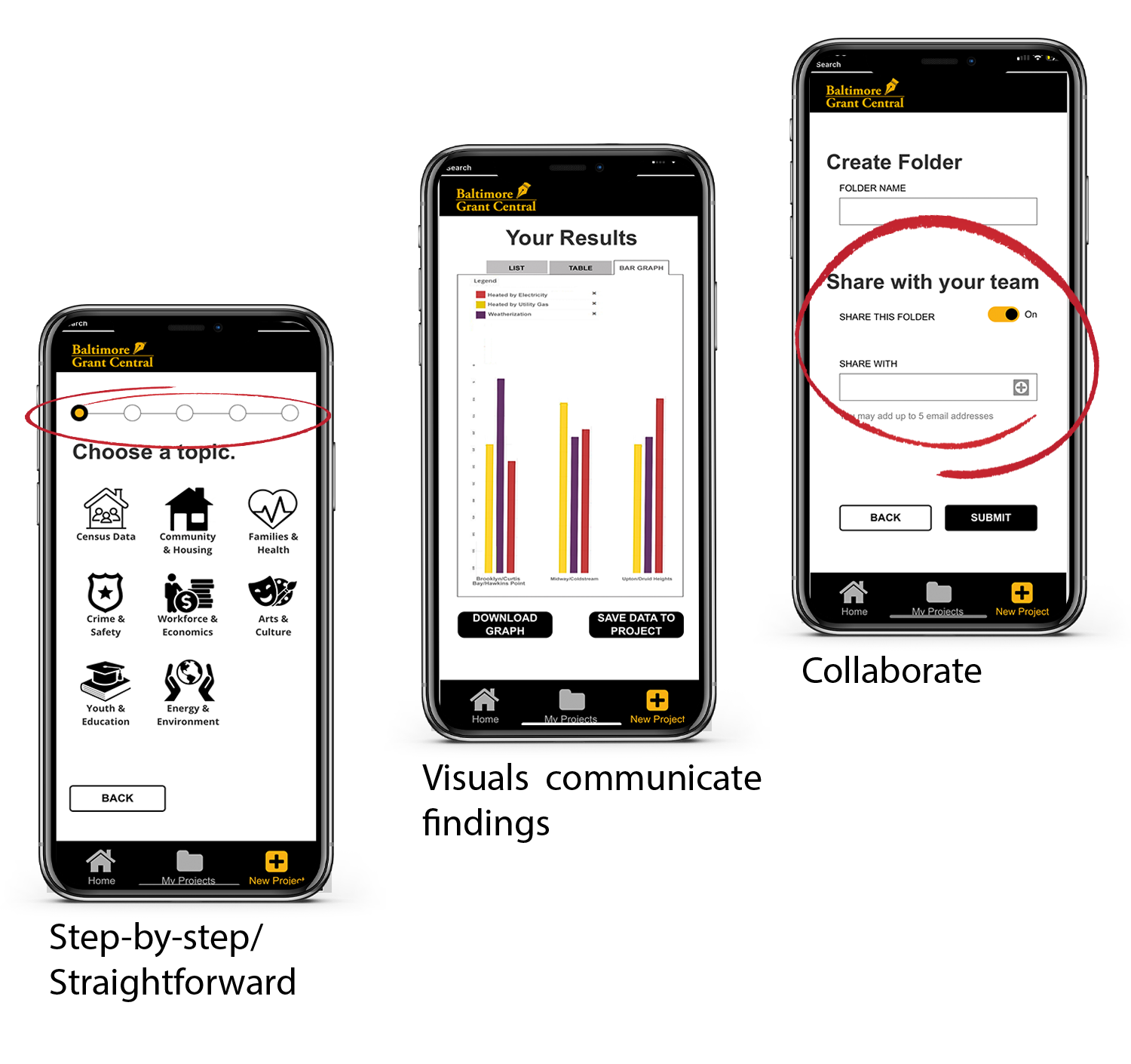
They all need a tool that will allow them to:
•research
•communicate findings
•and collaborate.
•research
•communicate findings
•and collaborate.
We wanted to build a tool that would incorporate these three aspects as well as the specific needs for each user segment.
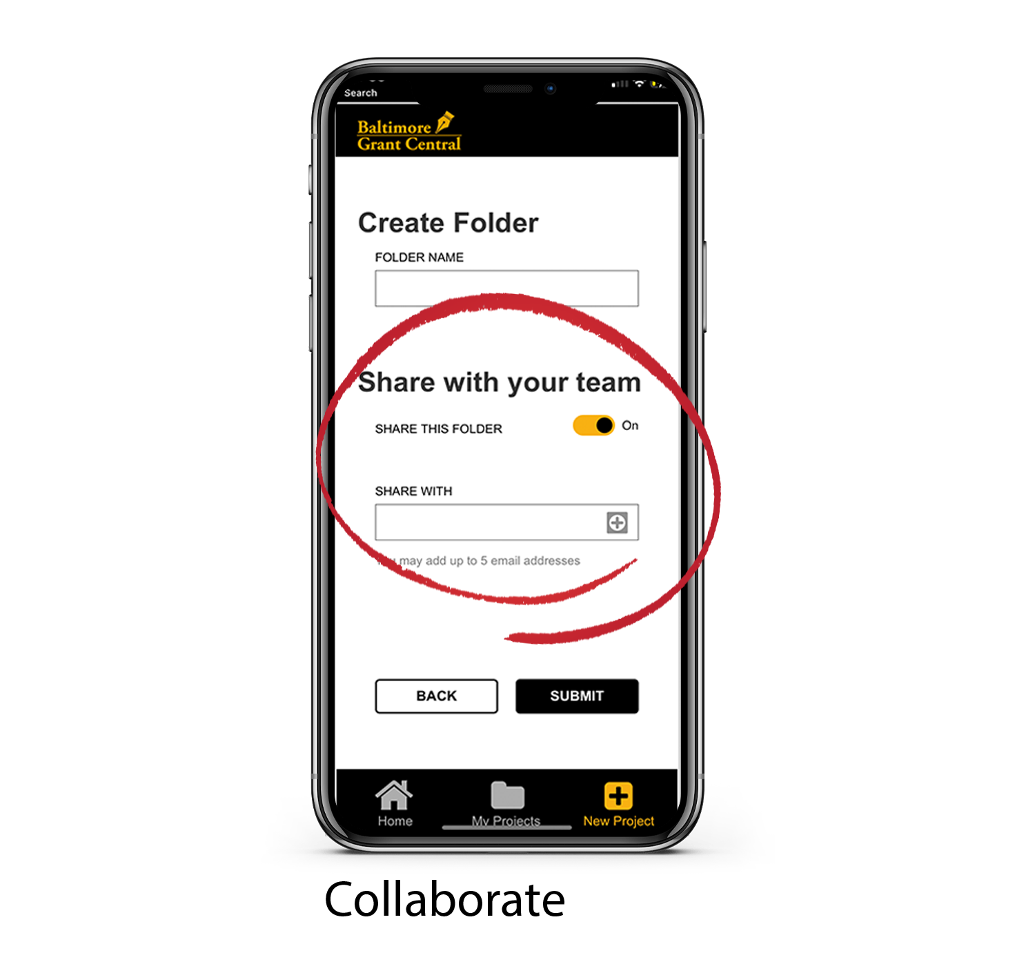
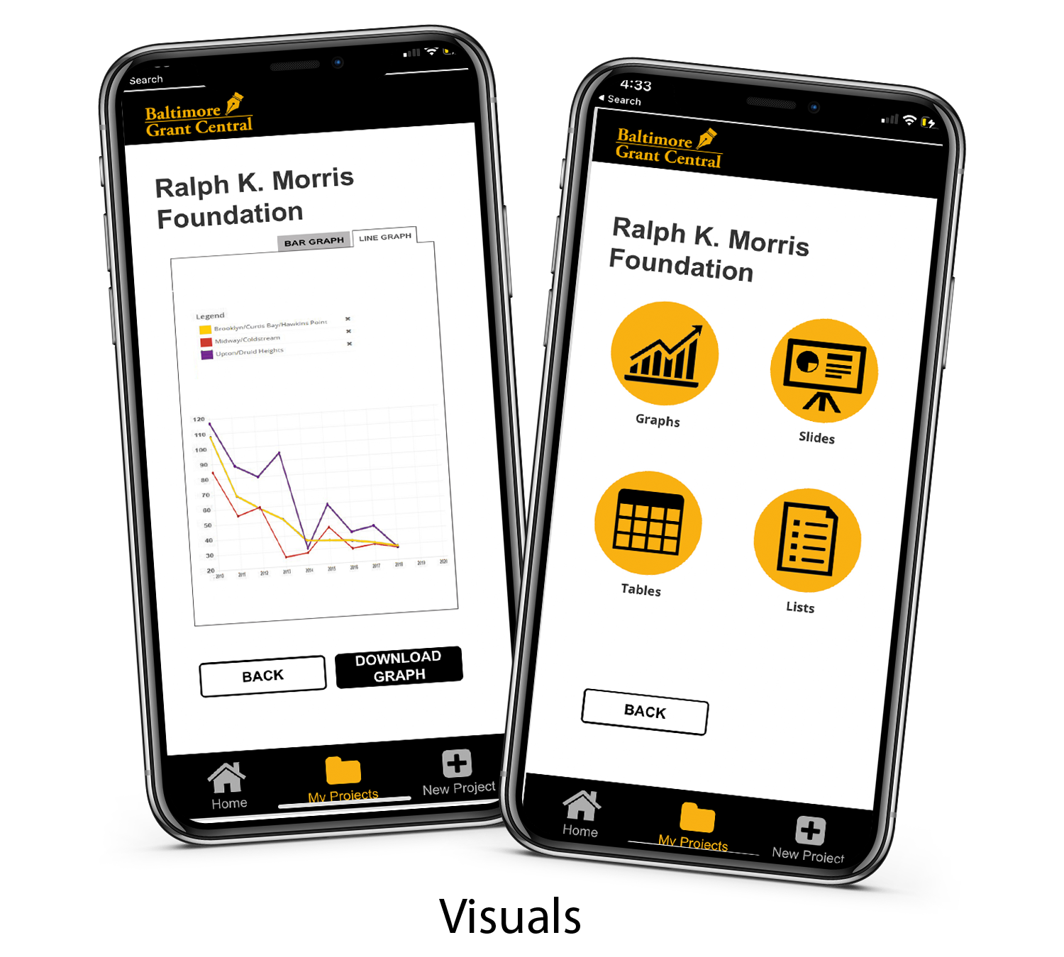
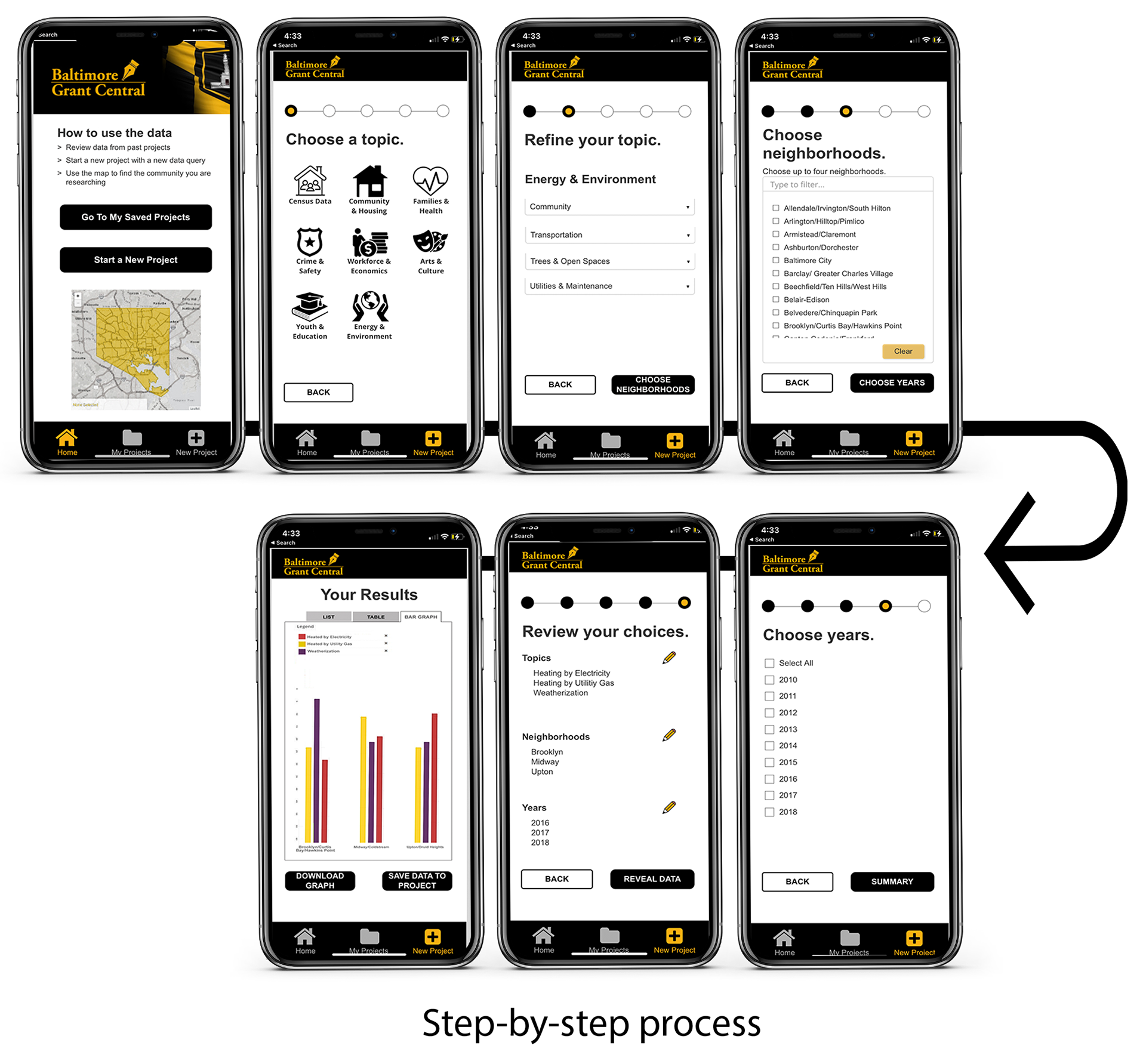
The pictures below display how BGC satisfy these user needs:
✓ Aids our users with a step-by-step research process
✓ Visuals to communicate their findings
✓ Allows them to share their findings.
✓ Straightforward to support novice grant writers
✓ Responsive to accommodate different environments.
✓ Aids our users with a step-by-step research process
✓ Visuals to communicate their findings
✓ Allows them to share their findings.
✓ Straightforward to support novice grant writers
✓ Responsive to accommodate different environments.
2. Generational Needs
Our research uncovered that the majority of grant writers belong to Gen X. A lesser amount are millennials and baby boomers
Gen Xers are typically:
•task-based
•independent
•collaborators.
•view technology as a tool rather than a distraction.
To support these tendencies, we created a task-based application.
We allow our users to select what task they would like to complete and guide them through the processes.
We allow our users to select what task they would like to complete and guide them through the processes.
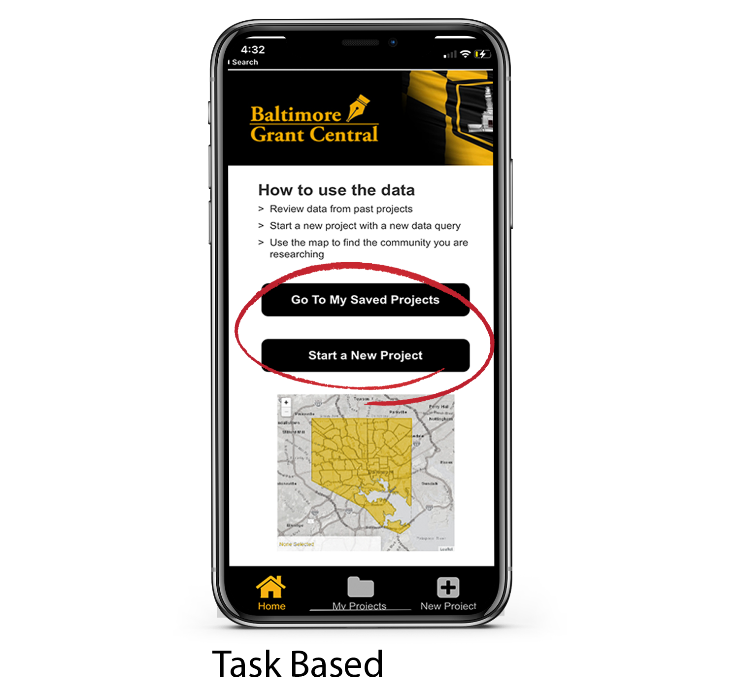
The guided processes also support our users' independent nature. Since the process is so clear, they will not need to reach out for help.
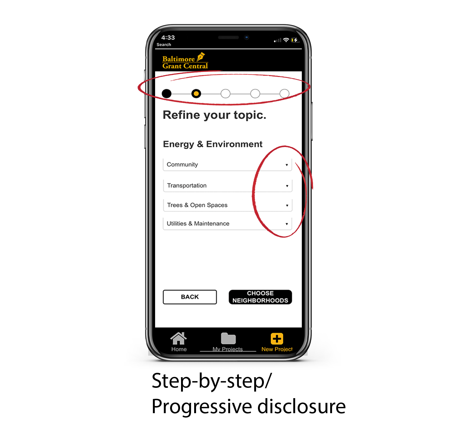
To eliminate distractions and provide a straightforward experience, we include a lot of progressive disclosure and avoid unnecessary text.
We also help this group collaborate with our collaboration feature.
The smaller percentage of grant writers are Millenials and baby boomers.
These two generations have many differences, but surprisingly the designs to support their needs overlap.
Millennials are typically:
•visual
•poor researchers
•technologically savvy
•have short attention spans
Baby boomers are typically:
•timid with technology
•overwhelmed by large amounts of data
•like large text and buttons
We incorporated visuals such as icons, graphs, and charts instead of large amounts of text. This supports our millennials' visual needs and prevents overwhelming our boomers with text.
We also broke up our information into a step-by-step process to avoid overwhelming the boomers.
This guided breakdown also supports millennials' short attention spans and poor research skills.
Personas
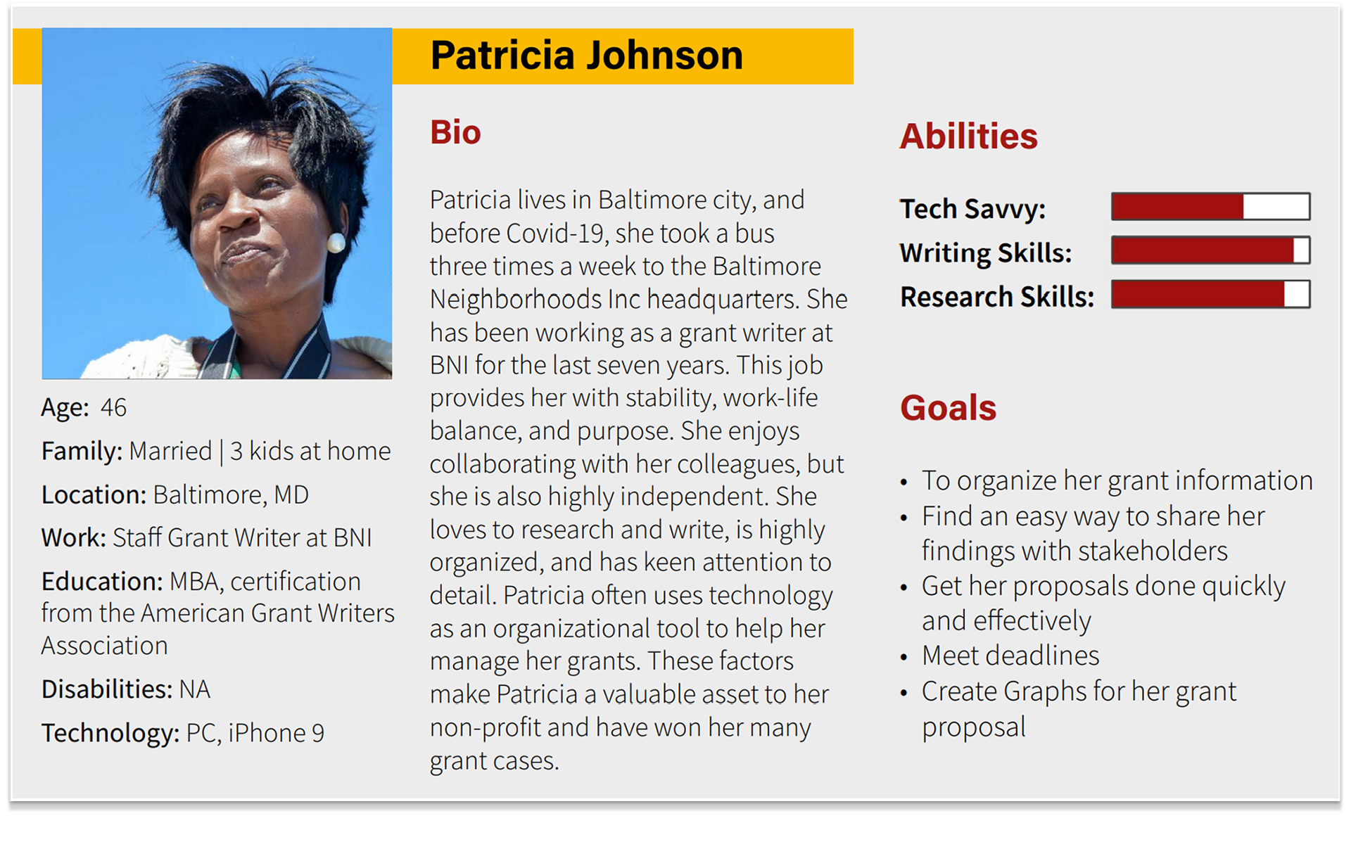
With the generational and occupational needs in mind, we created our three user personas:
1. Patricia Johnson (represents staff grant writers)
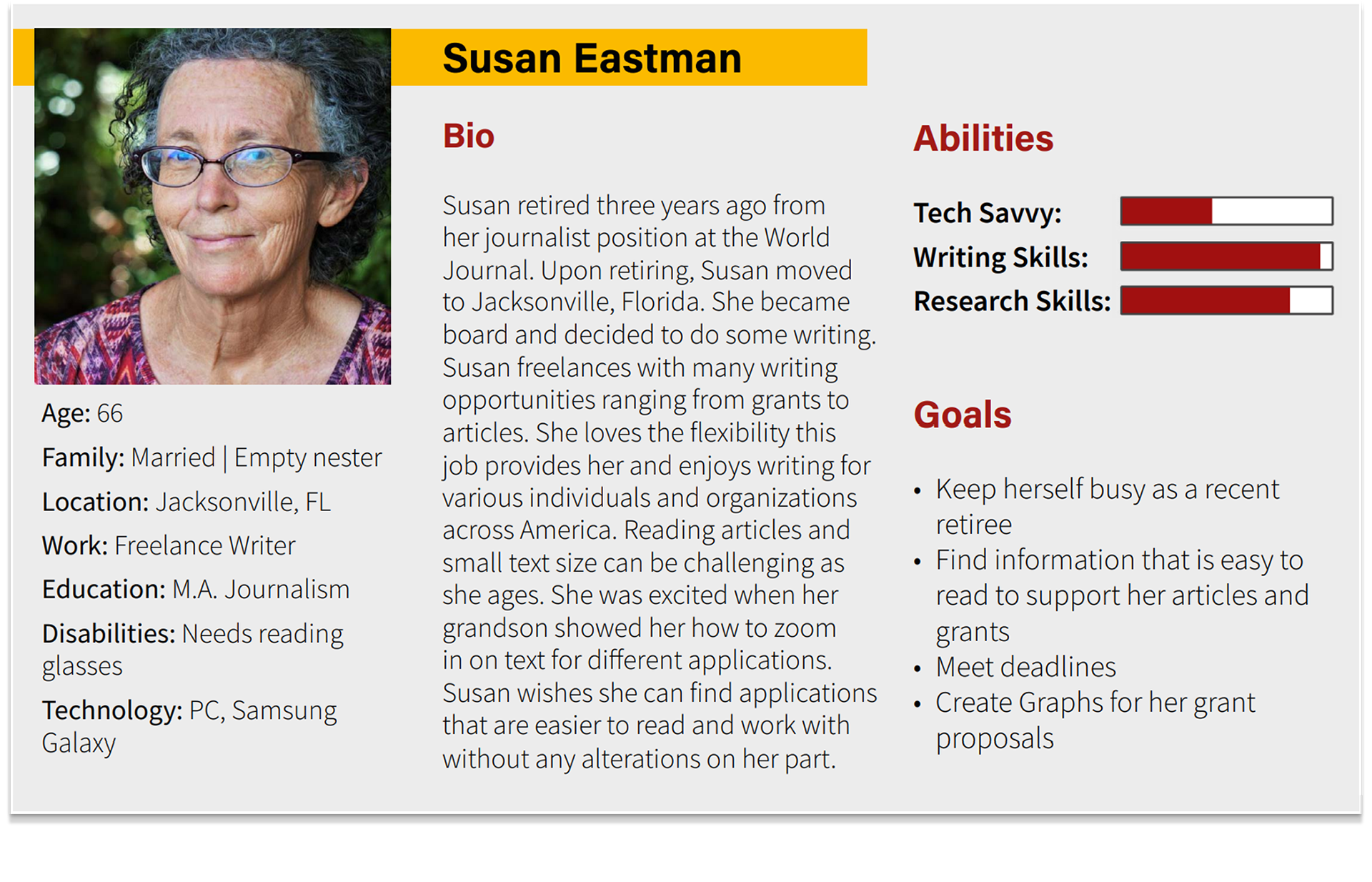
2. Susan Eastman (represents freelance grant writers)
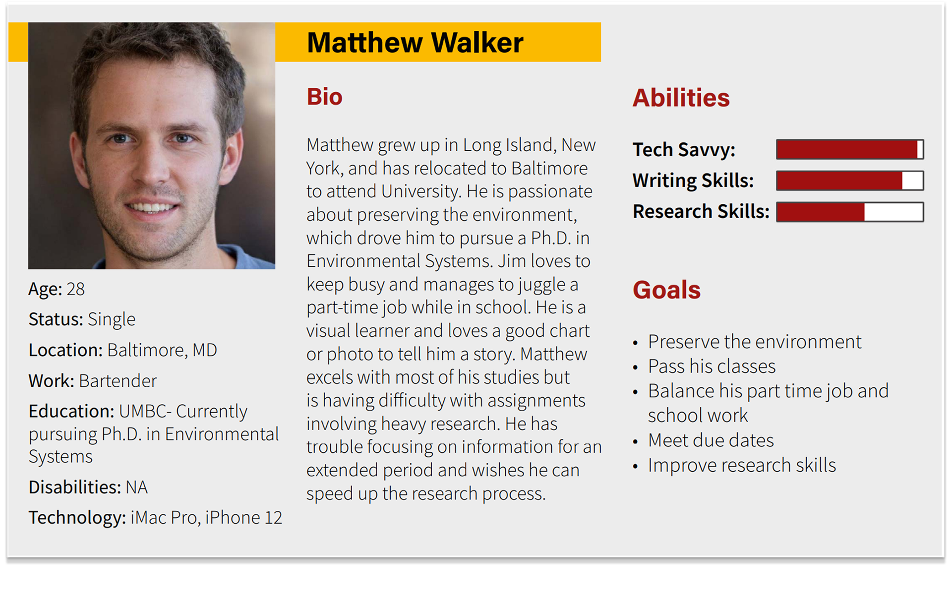
3. Matthew Walker (represents do-it-yourself grant writers)
2. Susan Eastman (represents freelance grant writers)
3. Matthew Walker (represents do-it-yourself grant writers)
1. The first user persona presents Patricia Johnson. Patricia is a Gen Xer and wants a straightforward tool to aid her in gathering and displaying data.
How we created this persona:
The persona was developed after researching the grant industry and the tendencies of Gen X.
The persona was developed after researching the grant industry and the tendencies of Gen X.
2. The second user persona presents Susan Eastman. Susan is a Baby Boomer and wants a tool that is easy to use and that supports her declining vision.
How we created this persona:
The persona was developed after researching the grant industry and the tendencies of Baby Boomers.
The persona was developed after researching the grant industry and the tendencies of Baby Boomers.
3. The third user persona presents Matthew Walker. Matthew is a Millennial. He wants an intuitive tool that will help him research his student grant proposal by using a lot of visuals.
How we created this persona:
The persona was developed after researching the grant industry and the tendencies of Millennials.
Displaying Data
Our literature review also focused on best practices for displaying data (my partner focused on this aspect).
After our initial research, we understood the basics of the grant industry and their possible need for sharing trends and patterns with stakeholders. A little more research told us that using visuals (for ex: graphs) rather than text can help users notice trends.
As a result, we researched best practices for displaying data.
Summary of Best Practices
• Keep it clean
• Avoid chart junk
• Use filters
• Keep it clean
• Avoid chart junk
• Use filters
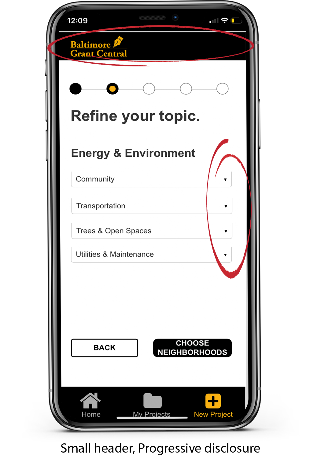
Keep it clean
We kept our header small and used a lot of progressive disclosure to keep the design clean and focused.
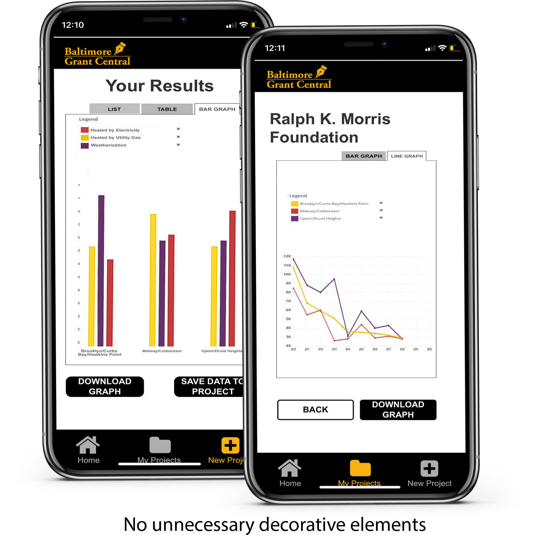
Avoid chart junk
We kept our charts and graphs simple.
We only displayed necessary information and avoided unnecessary decorative elements that do not increase the understanding of data.
Use Filters
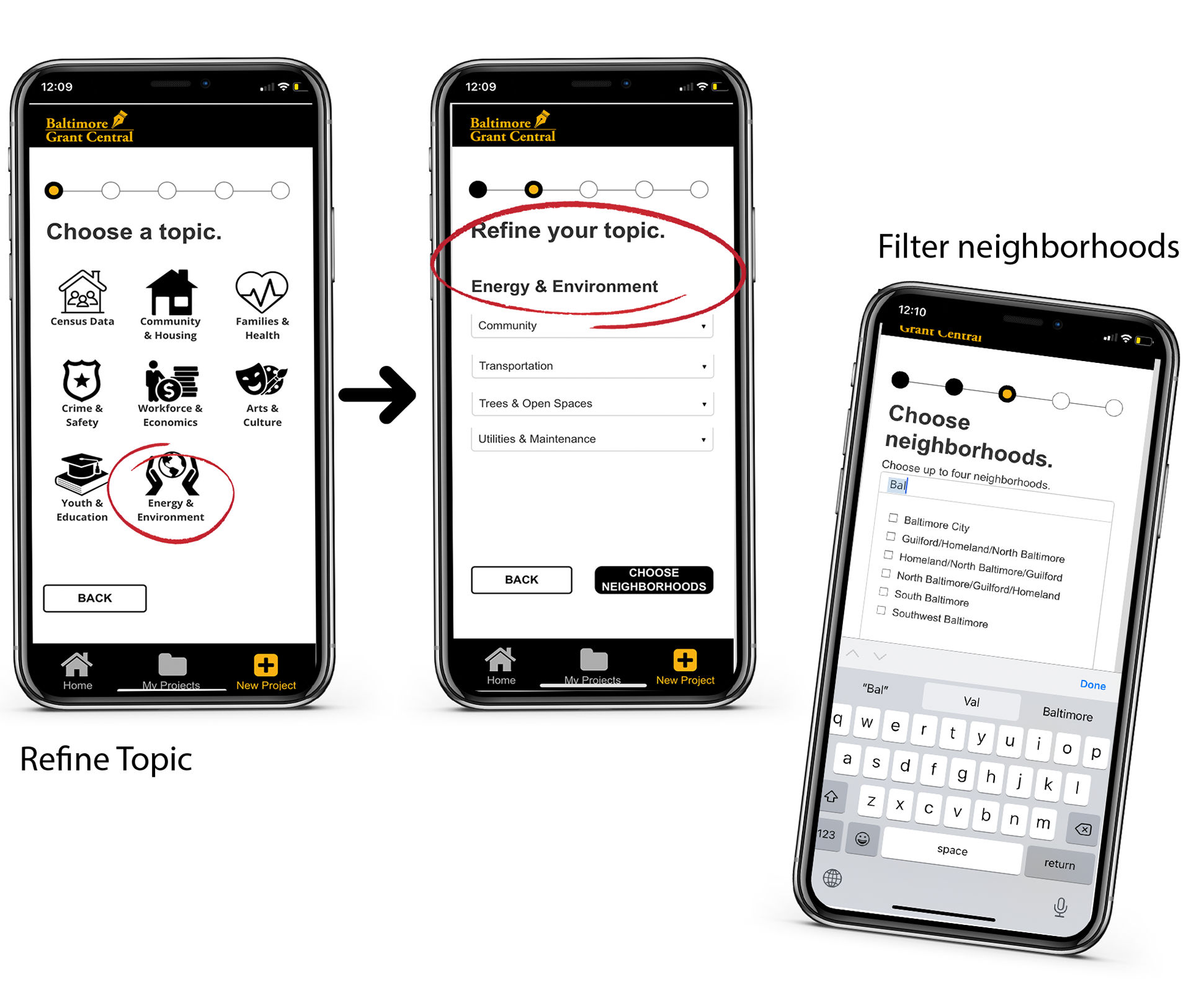
We used filters to help our users narrow down the information to focus on relevant information.
•Each step in the process filters information to display relevant and small amounts of information.
•The neighborhoods page has a filtering mechanism
Market Research
Before starting with our designs, we looked into the current tools available for grant writers. These are three of the competitors that we focused on for our review.
Competitors:
• Foundant GrantHub
• This Area
• GrantProseInc.com
• This Area
• GrantProseInc.com
Summary of Findings
We found that these tools did aid grant writers in some way, but none did what we hope to achieve through our new application BGC.
our goal: is to help grant writers sort through current census-like data, create clear visuals, and share those visuals with stakeholders.
our goal: is to help grant writers sort through current census-like data, create clear visuals, and share those visuals with stakeholders.
................................................
Design phase
Now that we understood our users and their needs, we started to design our wireframes. Once we came up with a basic design we liked, we made our wireframes into interactive paper prototypes.
Paper Prototypes
1st Iteration
Supporting our user's needs
As mentioned in the user's section, we based our design decisions on occupational and generational needs.
• To cater to the majority of our users, Gen Xers, we made the tool task-based, clean, and straightforward
• To cater to Millenials and baby boomers, we made the tool visual, guided, and chunked it into different steps.
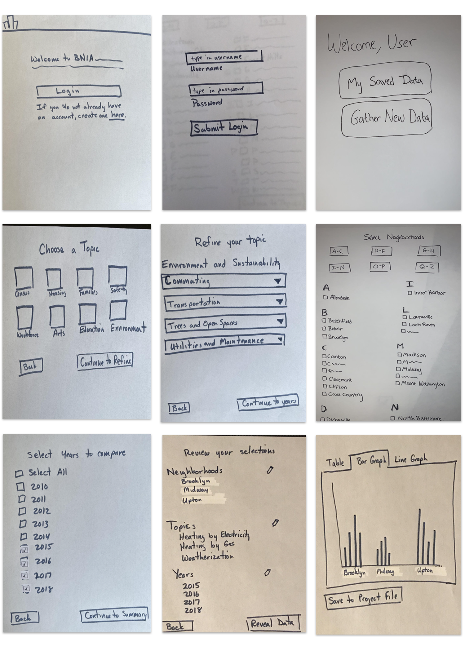
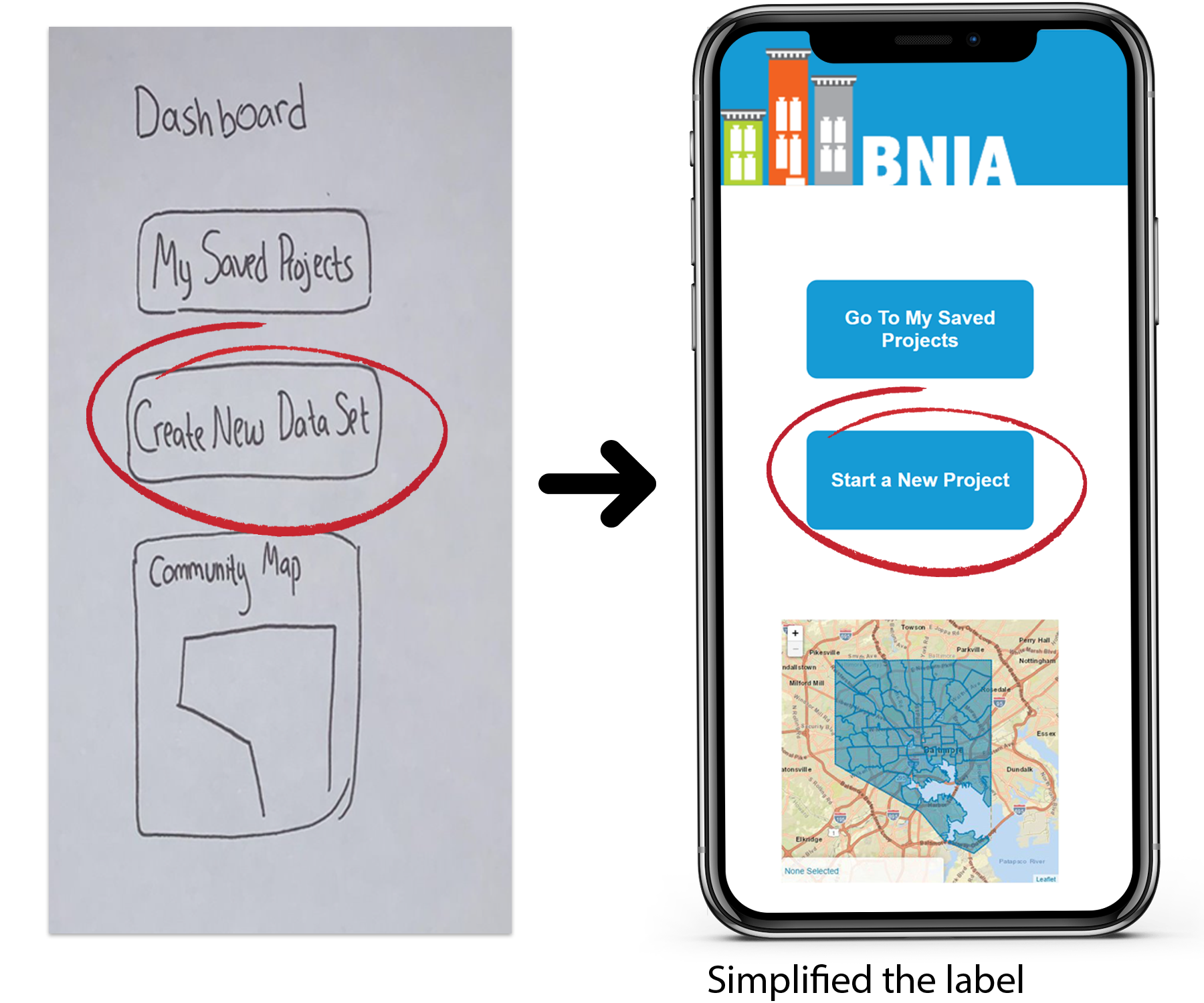
These images display our group's paper prototypes. They display the login page, home page, and main task of starting a new project.
User Testing
Pilot Test- Class user testing
We tested our first set of wireframes in an online in-class user testing session.
•We gave our classmates a task to complete.
•We then acted as the computer as they completed the task
A paper prototype session in action
Testing Results
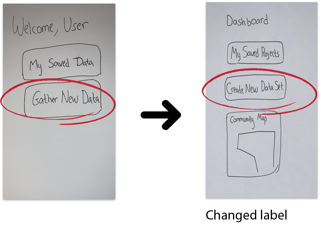
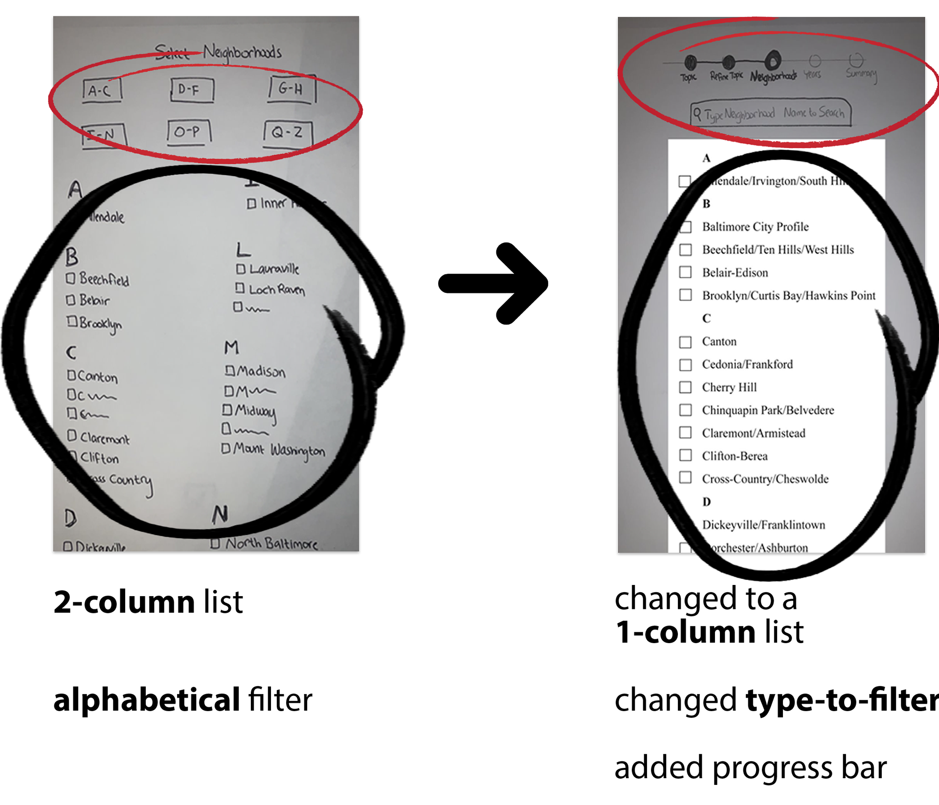
After our in-class testing, we made slight changes to our designs:
1. We changed "Gather New Data" to "Create New Data Set" - to clarify the purpose of the label
2. Typed up our list of places into a one-column list - more mobile-friendly
3. Swopped the alphabetical filter for a type-to-filter - less cluttered, more direct, and mobile-friendly
4. Added in a progress bar - to clarify how many steps are in the process
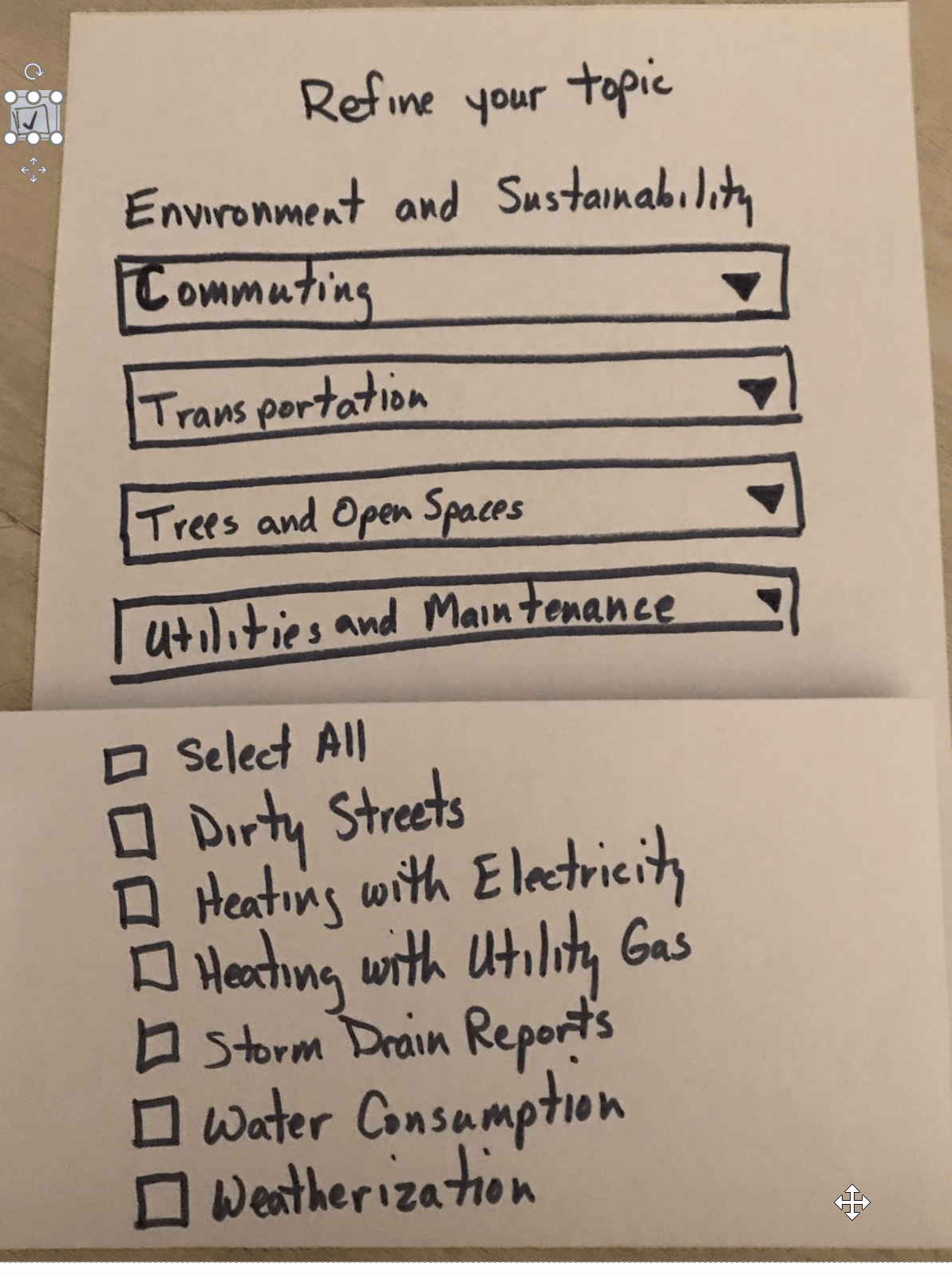
5. Multiple versions of groupings
EX: This group was listed in 3 ways:
• Allendale/Irvington/South Hilton
• Irvington/South Hilton/Allendale
• South Hilton/Allendale, Irvington
- this supports someone who is looking for any of these locations
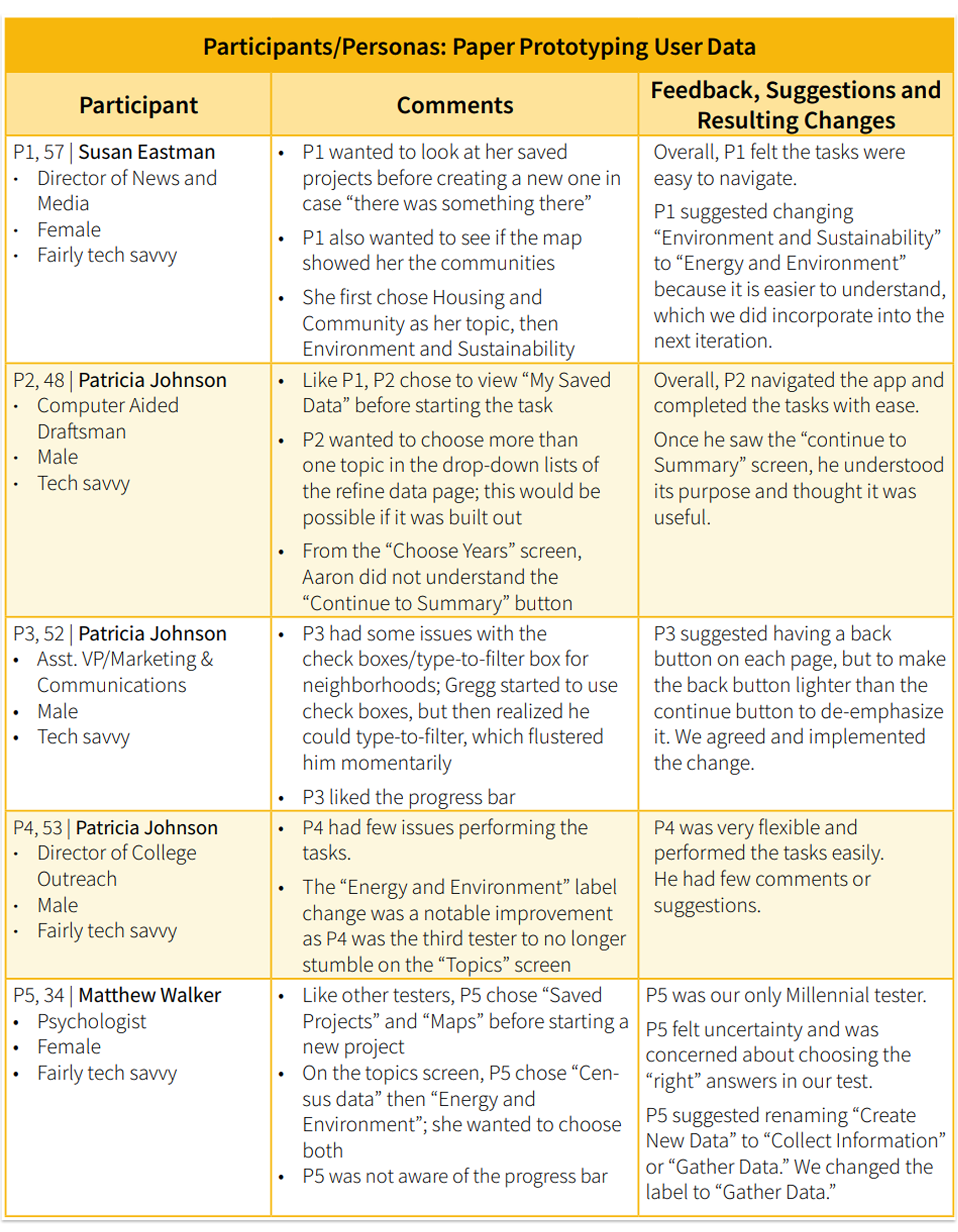
Paper Prototype: User Testing
After making the slight changes from the pilot test, we moved on to testing potential users.
Since our class project was limited, these users included family and friends who fit any of the criteria of our user segment.
Our users ranged from professors who were Gen Xers, to those who had a Ph.D. and had written a grant before.
How we conducted user testing:
• Set up a zoom meeting with our users
• Gave participants a task to complete
• Asked our participants to "think out loud"
• Wrote down important insights and feedback that we received
• Made the appropriate changes to our prototypes
Summary of results:
After analyzing the testing and receiving feedback from our participants we:
•Made slight changes to the copy of some labels and headings
•Added and took away some buttons
.
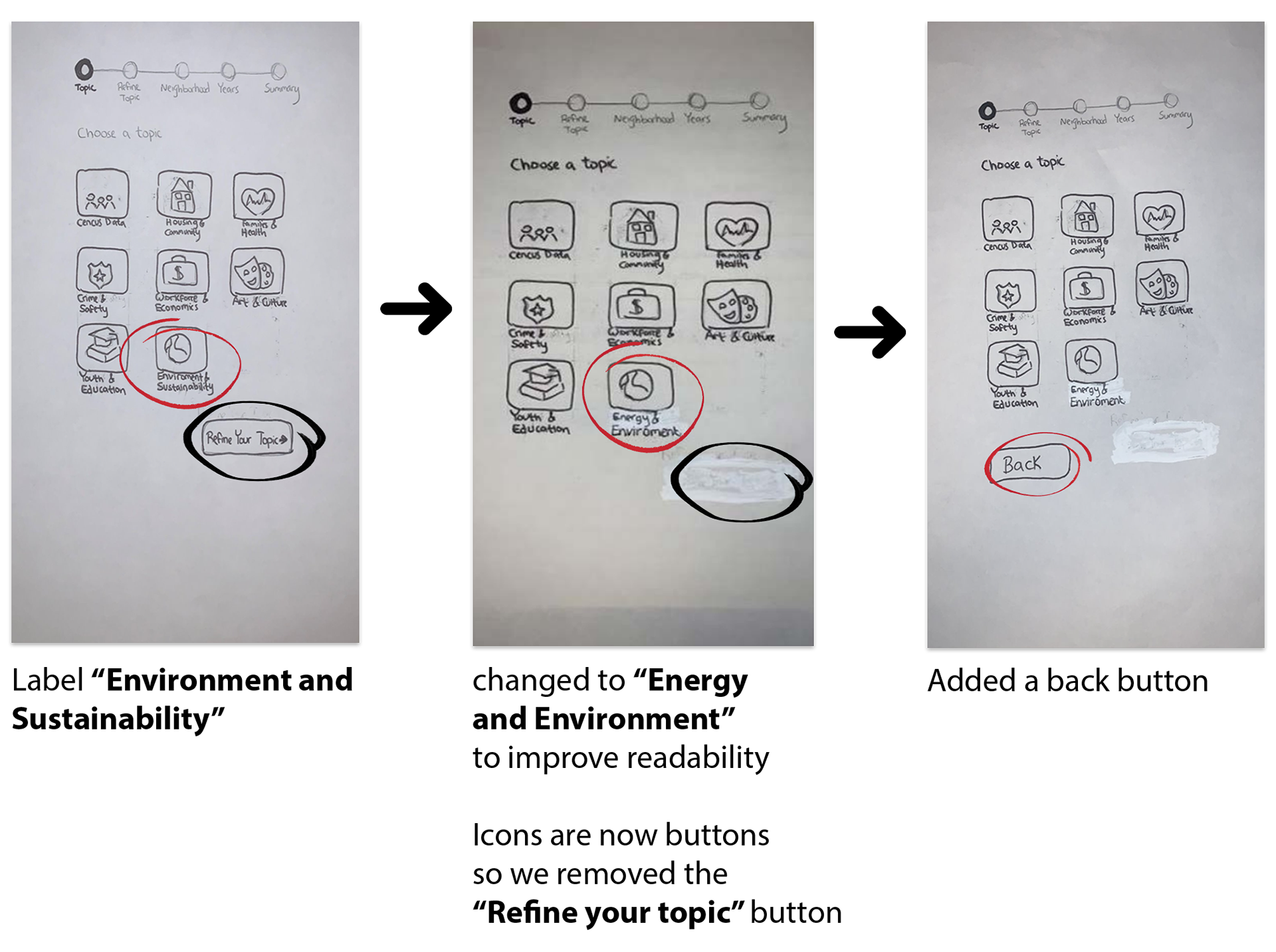
Here is an example of how our prototypes evolved throughout user testing:
Here is a chart displaying our user testing data:
Electronic Prototypes
After receiving feedback from our users, we moved on to creating electronic prototypes on Axure
My partner and I had never used Axure before and got to learn the tool throughout the creation of the prototypes. We looked at Google for guidance and played around with the application.
1st Iteration
We created the first version of our electronic prototype. This prototype differed slightly from our paper prototypes.
•We changed some labels
•We also built out our "saved projects" section.
Pilot Test- Class user testing
Once we completed our design we tested them on our classmates. Like the paper prototyping testing, we gave our classmates a task.
However this time, we did not act as the computer (since it is an electronic prototype). Instead, we asked them to speak out loud and watched them go through the process.
Results:
• our classmates like the clean aesthetic of our site
• they also like the progress bar
• they recommended that we add in a home button to improve navigation- since they could not figure out how to return home
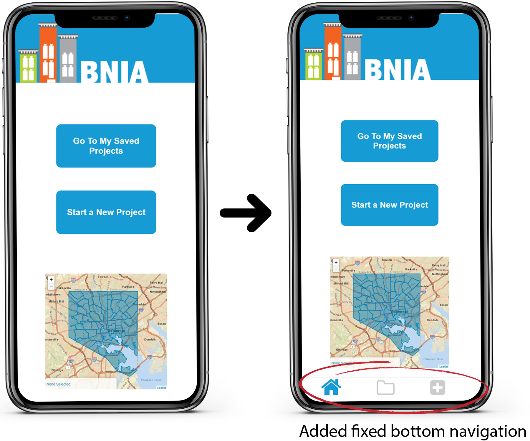
2nd Iteration
Applying Feedback:
Before moving on to real user testing, we made navigational changes based on our pilot study.
Instead of adding a home button on every screen (like our participants recommended), we added a fixed bottom navigation.
This navigation includes a home button and the two main tasks of our tool:
•create a new project
•view saved projects
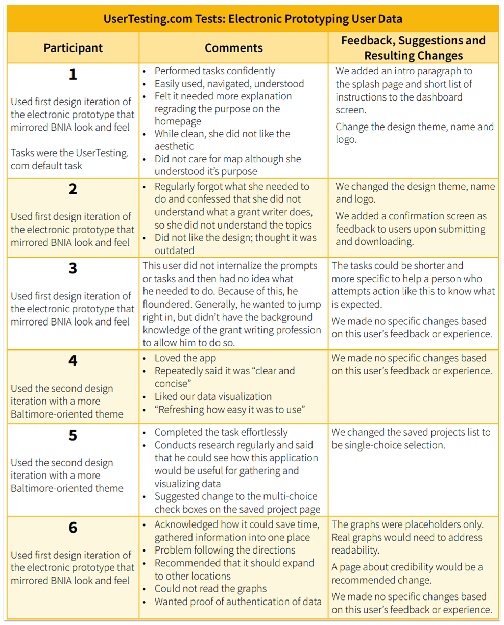
User testing- Via UserTesting.com
We used Usertesting.com to test out our prototypes.
Participants
There were 6 participants who participated in the testing. These participants had to pass our screener to take the test.
We divided these participants into two groups to represent our different target audiences.
1. the first group was focused on Gen Xers who had the education level of Grant Writers.
to ensure that this was so, these participants had to pass a screener:
•The screener asked if they were 40 - 57 years old
•Country of origin: United States
•Language: English
•Education level: Bachelors or higher
2. the second group was focused on millennials who may be writing a grant for various reasons.
•The screener asked if they were 25 - 40 years old
•Language: English
This group then received a follow-up screener with another set of questions:
• a. Are you currently enrolled in a Ph.D. program?
b. Or have you already earned a Ph.D.?
b. Or have you already earned a Ph.D.?
•a. Have you received, at minimum, a bachelor’s degree or equivalent?
b.Are you a writer or researcher?
b.Are you a writer or researcher?
If participants answered yes to any of these questions, then they were able to participate in the study.
Testing
Once the test began:
•Participants were presented with a scenario
•Asked to speak out loud
•And confirm that they were okay with being recorded
Scenario/Tasks
Our first participant received the default task from Usertesting.com. As a result, their feedback was more general. This participant said that the app was easy to navigate, but mentioned the unattractive appearance of the app a few times.
The rest of the participants received the same tasks that we had used during the paper prototypes testing:
•Asking users to gather data
•And access the data later in their saved data section
Summary of Results
First 3 participants
Overall, our first three participants were positive about the application. They said it was easy to navigate, understand, and had a clean feel.
Below are some points that our participants had trouble with or gave feedback about:
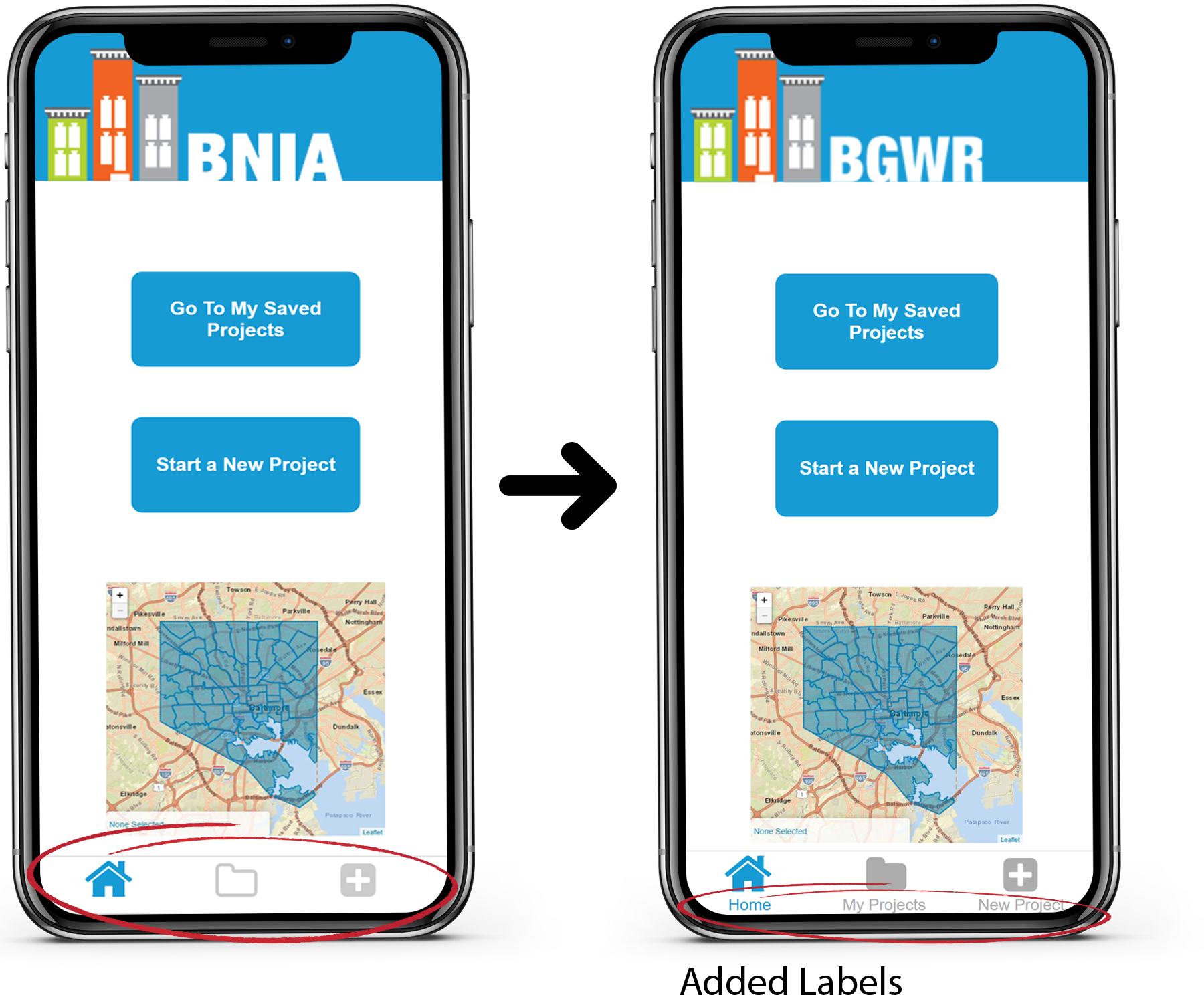
1. The first participant did not understand the meaning of the different labels in the bottom navigation
As a result, we added labels to the icons before the next participant took the test
Once we made this change, the rest of the participants seemed to understand the meaning of the navigation items
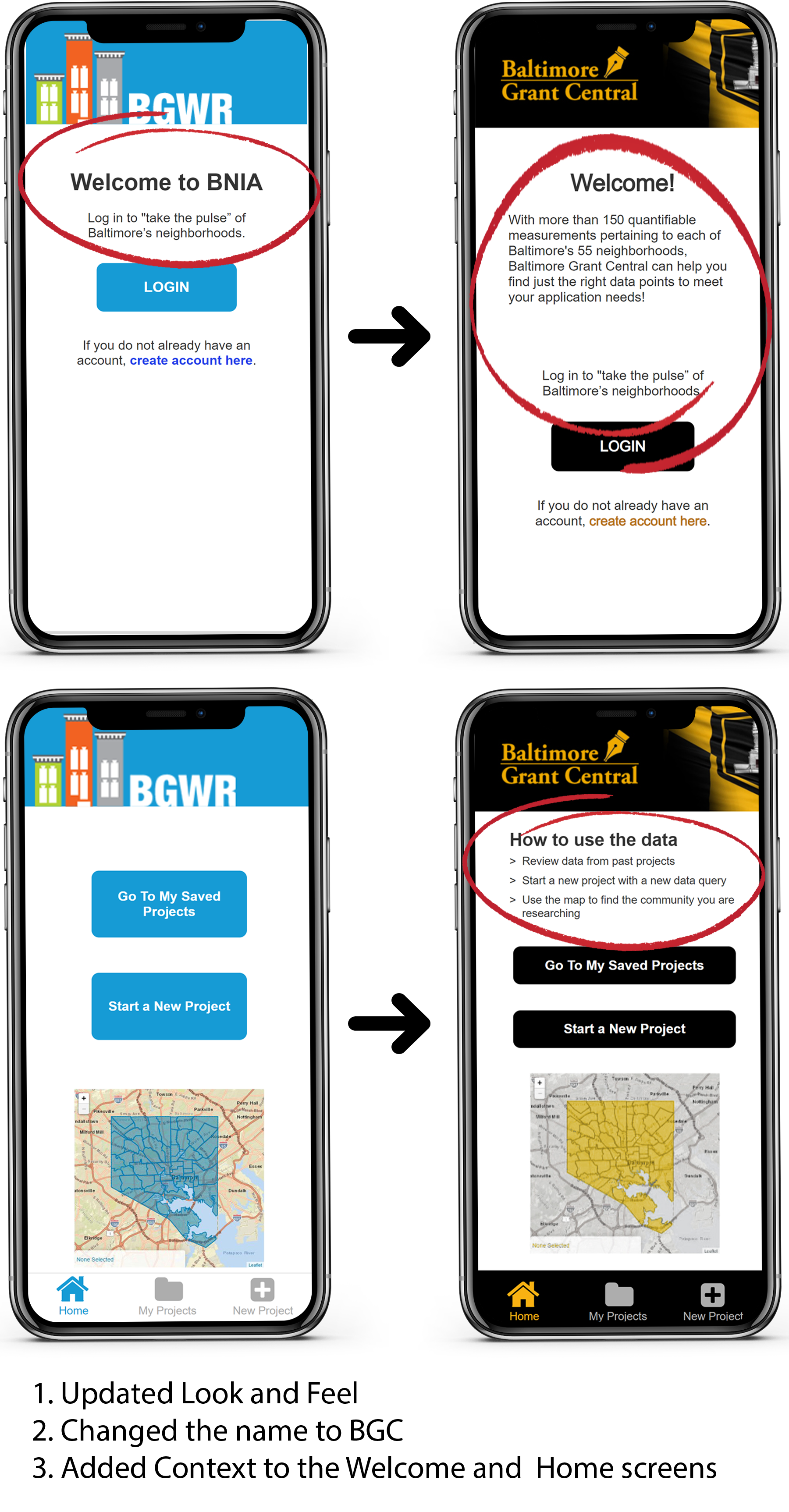
2. The first two participants mentioned the poor aesthetics of the site
As a result, we updated the appearance to make it more grant-focused and Baltimore-centric.
Once we made this change (after the first three participants completed the testing), the rest of the participants did not mention the app's appearance.
3. The first participant did not understand the purpose of the app from the landing page
As a result, we added context to the welcome and home screens
Once we made these changes, the rest of the participants seemed to understand the purpose of the app.
3rd Iteration
The changes mentioned above were implemented before starting with our next set of testers (added more context and changed the visual appearance)
Summary of Results
last 3 participants
Overall, our last three participants were positive about the application.
None of these participants mentioned the aesthetics and instead focused on the functionality of the app.
They said it was easy to navigate, understand, and use. They mentioned that BGC would be a useful tool for gathering data in the Baltimore area.
Below is a quote from one of our participants while going through our app:
“Graphs and data can often be complicated and hard to read and hard to figure out. This was easy and not intimidating.”
We only reciveced one peice of constructive feedback from one of our partcipants that we applied before finaliznaling our design
1. To change the multi-select checkboxes on the save your projects page to a single selection.
•As a result, we swapped the multi selection to a single selection.
We felt this change would make more sense for the funactionalrty of the tool. Users are most likely to view one project at a time. If they would like to select other projects simontaniosly they can return to the main page to do so (like one would do on microsoft word)
Here is a chart displaying our electronic prototype user testing data:
..............................................................
Final Designs
Below are two videos going over the main tasks of Baltimore Grant Central
Task 1: Gather data for a new project
The user in this video is a new user. To start a new project they must:
1. Create an account
2. Then click either:
"Start a New Project" on the home screen
Or click "New Project" on the bottom navigation
User Needs Hit
✓ Visuals to communicate findings
✓ Visuals to help users process information
✓ Progressive disclosure
✓ Context and directions
✓ Task-based
✓ Clear CTA
✓ Context and directions
Watch the video below to see all of the above information in action ↓
(This video is on the top of the page as well so feel free to skip it.)
Task 2: Download a previously saved project
The user in this video is an existing user. To download a previously saved project they must:
1. Login
2. Then click either:
"Go to my Saved Projects" on the home screen
Or click "My Projects" on the bottom navigation
User Needs Hit
✓ Large Titles
✓ Visuals to help users process information
✓ Progressive Disclosure
✓ Filters and Sorting
Watch the video below to see all of the above information in action ↓
..........................................................
Now it is time to reflect...
What I learned
1. Focused and narrow designs can produce valuable tools
•At first, our team was hesitant about creating such a narrow app with limited features. Our user testing proved to us that the simplicity of the application is what made it easy to navigate, understand, and use.
•At first, our team was hesitant about creating such a narrow app with limited features. Our user testing proved to us that the simplicity of the application is what made it easy to navigate, understand, and use.
2. Communication is Essential for Task Completion
•Designing: When we made minor changes to labels and added context, directions, and text, our users could utilize the application.
If one can not communicate what users should do while using your app, then it will not be helpful to your users.
•User Testing: Communicating clear direction can affect the accuracy and value of user testing.
3. Workflows Vary Across Users
•Our many rounds of user testing have proven the importance of creating various user paths to support the different tendencies of users.
•Our many rounds of user testing have proven the importance of creating various user paths to support the different tendencies of users.
That is all for now. Thanks for coming along on my journey :)
If you want to collaborate click the button below to contact me